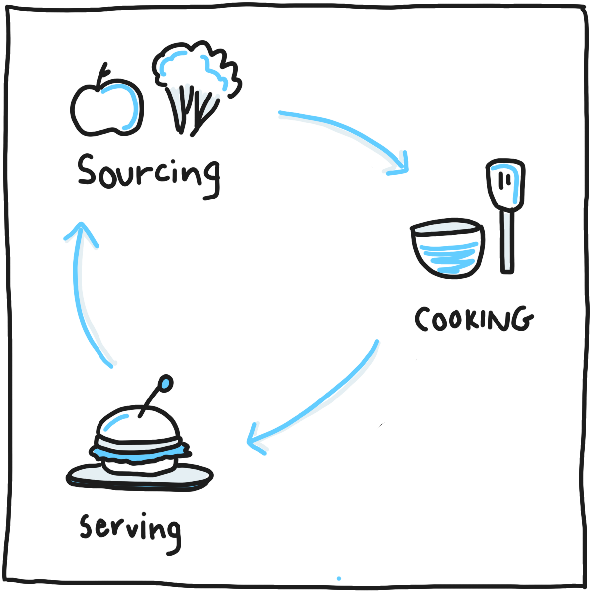
The Zomato for Business (ZFB) app is for restaurant owners. They can use the app to edit restaurant information, keep in touch with customers, and understand restaurant performance. The app has over 40K monthly active restaurant owners today.
The ZFB app has been around since 2011, and it’s been long due for a redesign. When we started this project, we came up with a set of product goals that the new app should meet. From these product goals, we filtered down to the following design goals.
Let’s start with the design process, followed by how we worked towards the goals mentioned above. I worked with my colleague, Sneha, on this project.
(June 1 2018) Note: the app UI is still in development, so I’m only able to share a few of the latest mockups. There will probably be some adjustments in production before we go live :)
Over the last few years, we gathered a ton of data from restaurant owners – via interviews, anecdotes, feedback emails – about how they use, struggle with, and would like to improve the Zomato for Business app. With our regular monthly customer visits, we understood how they use the app.
Highlight 1: Restaurant owners are busy people. Some take care of end-to-end operations for their start-up business, some manage a couple of restaurants in the city (i.e. a chain), and some are focused on a certain vertical of the company. They don’t have much time, and their focus on Zomato and other online platforms is for just a few minutes in the day.
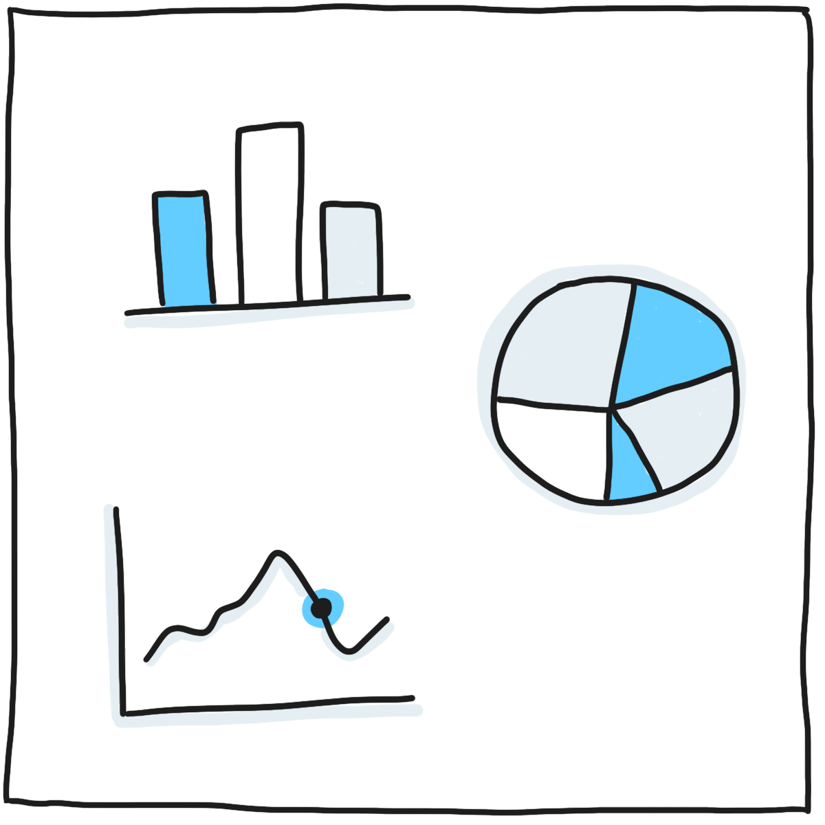
Highlight 2: Restaurant owners mentioned that they’d love to have a summary of what’s happening with their business. Since Zomato is the only platform in India with rich content of restaurant photos and menus, owners want to know what traction their page is getting. Above this, they would like to get numbers on online orders, table bookings, and other verticals.
Highlight 3: Many have written to us with feedback on the features in the app. They noted that we are lacking some basic functionality such as, creation of recurring events and the inability to upload PDF menus. We consolidated this information and proceeded to incorporate design and tech changes in the new design.
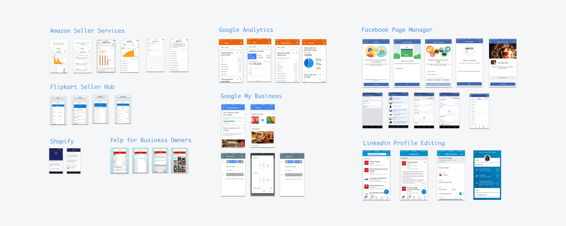
When you’re off the market for a while, it’s important to do your research and bounce back! We looked at how other tech companies in the world design their Business apps. Below are a few places we looked at for their designs.
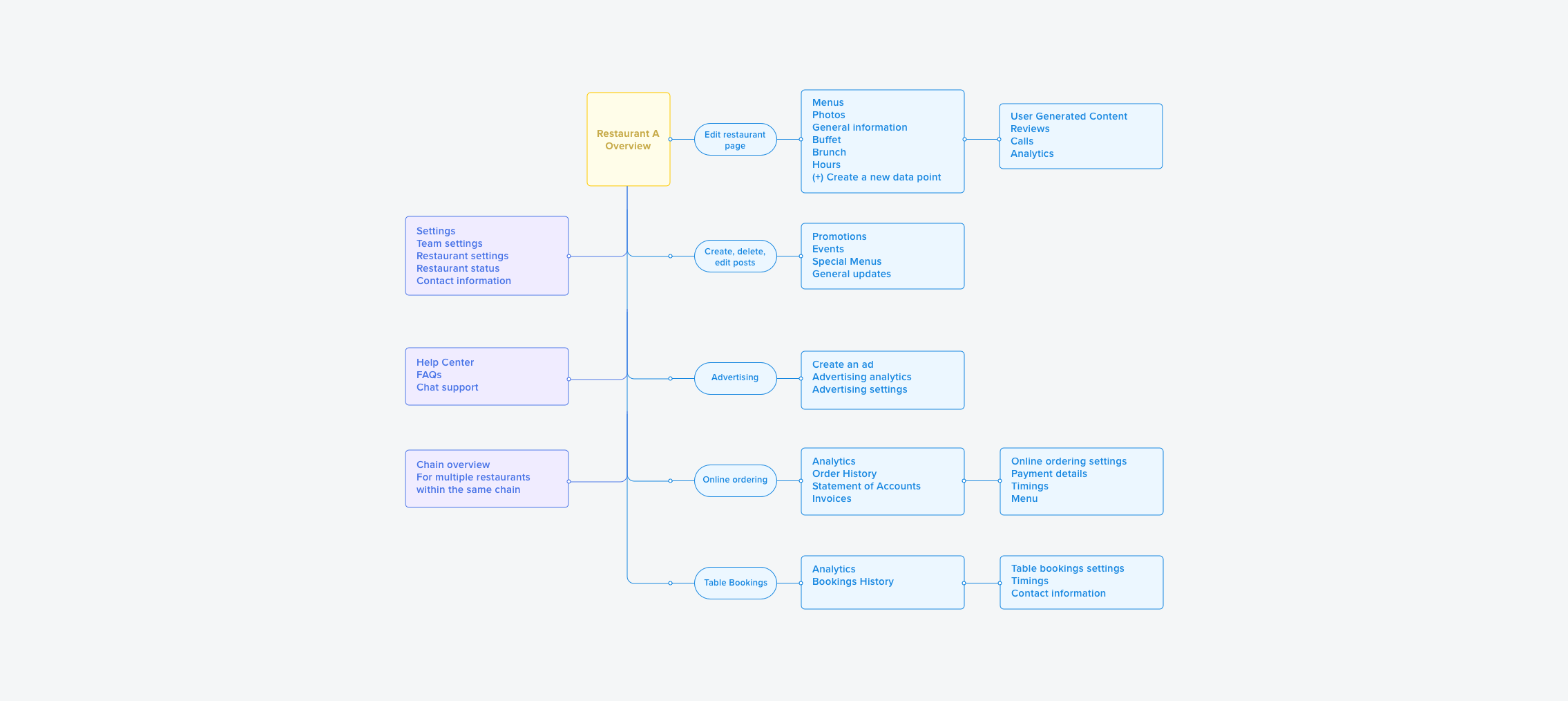
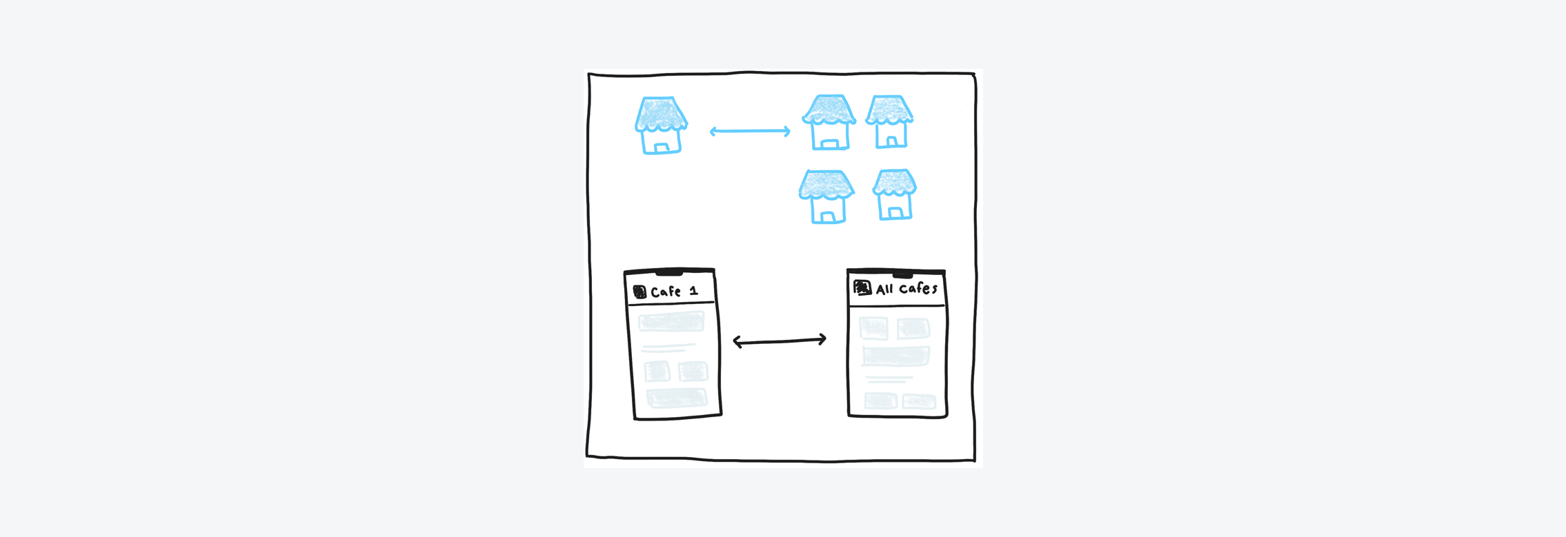
We started fresh with the information architecture of the ZFB app. We learned from owners that they view each restaurant as a different business entity, and don’t aggregate numbers across restaurants. So we went with an architecture that allows an owner to look at one restaurant at a time. And then we iterated many times on the UX of the homepage and restaurant page.
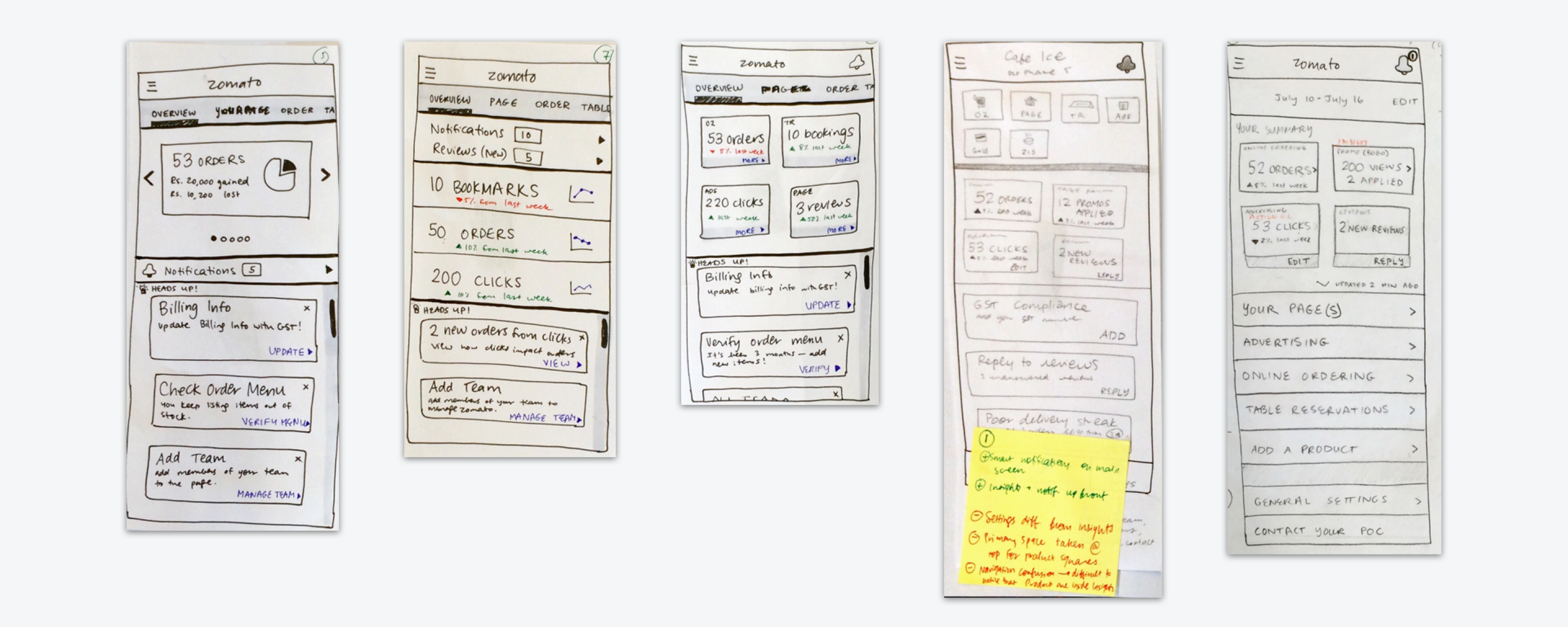
We also mapped out the entire app as it currently exists, and ensured that existing features and new features fit nicely into the architecture we are designing.
Now let’s jump into the design goals discussed earlier, and look at how the mockups for the ZFB app redesign meet these goals.
In the current ZFB app, it’s tough to figure out where to start when you want to achieve a certain action. One must really explore the entire app a few times to get the hang of where features are located.
With the new app, the goal is to branch the user out into the different verticals, content generation flows, new products, and the help center as quickly as possible on the homepage. We’re also adding onboarding for new users when they enter the redesigned app.
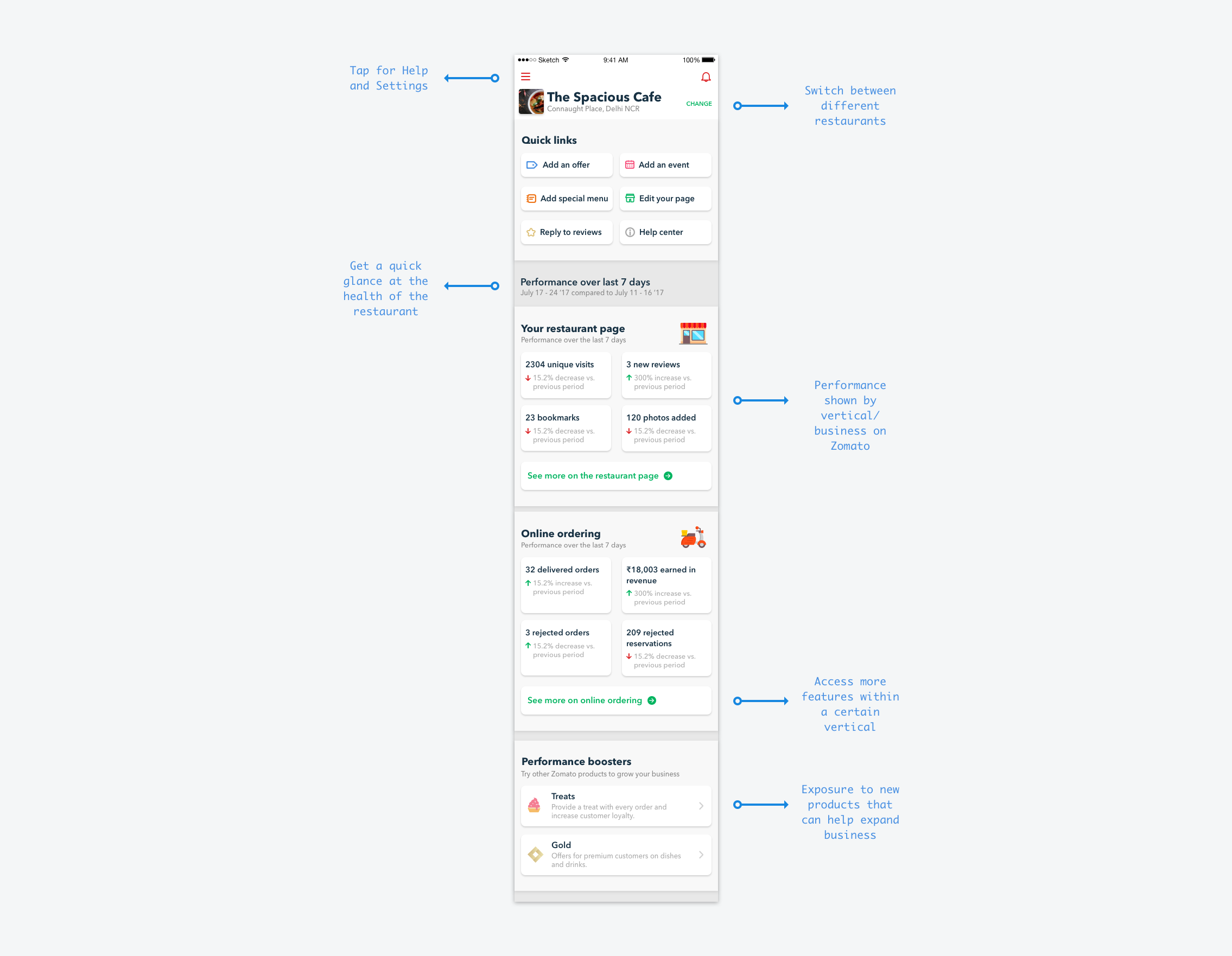
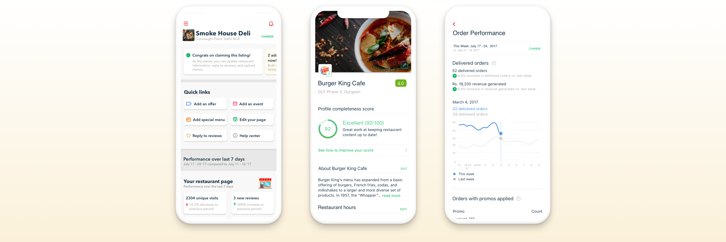
The first goal of the app design is to make it easy for restaurant owners to edit content on their restaurant page and add new content (post promos, events, menus, photos, reply to customers, and so on).
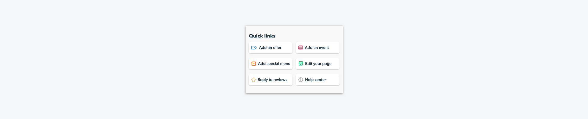
Usability testing the homepage led us to realize that content generation was hard to find if it’s buried layers within the app. A huge change we made after several tests was to include quick links on the top of the homepage. Surfacing these links at the top can significantly increase merchant engagement.
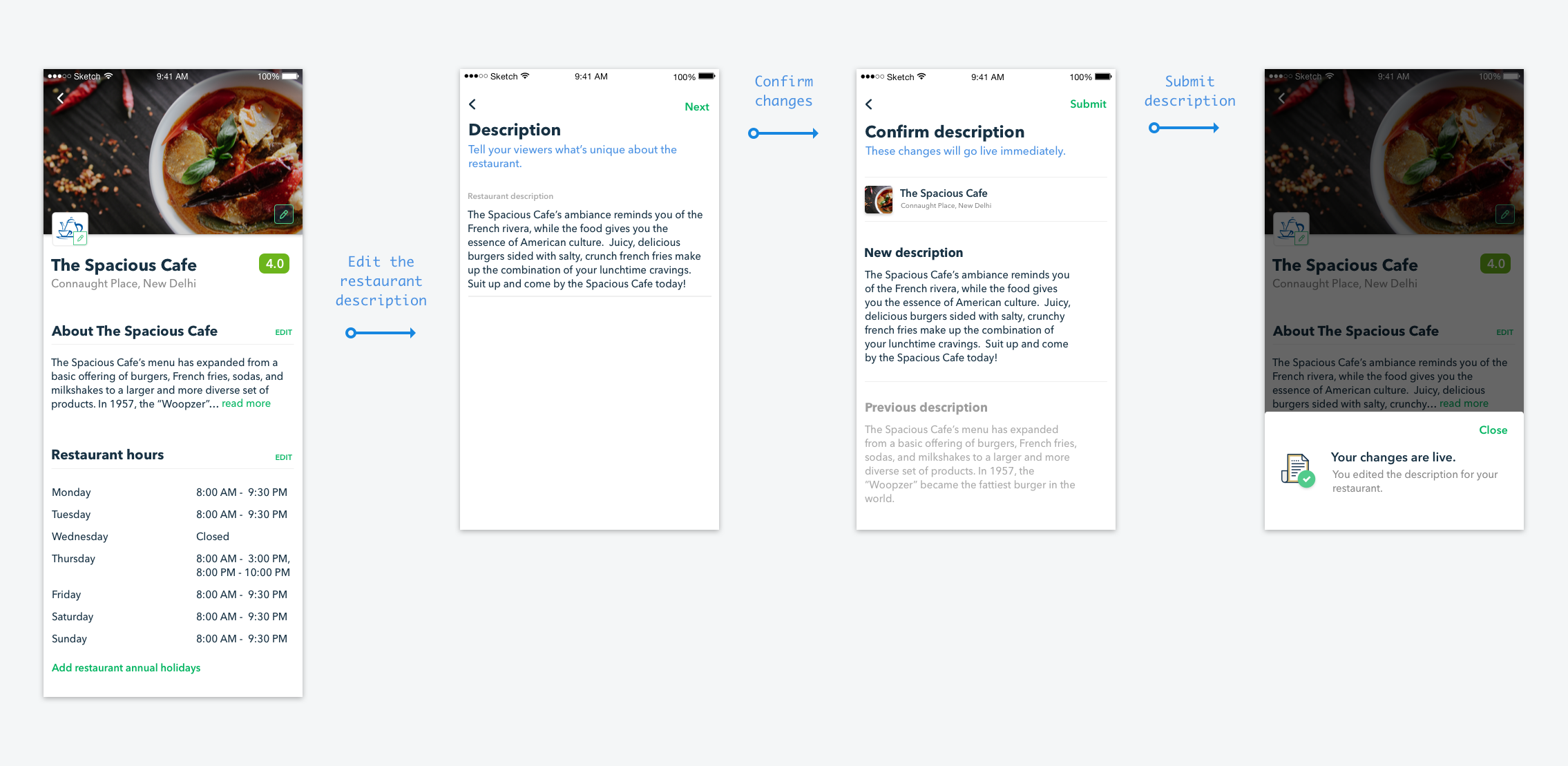
Second, we realized that the current ZFB app makes it very obscure to edit the restaurant page. There’s no feedback on the app to see the change nor a live preview of the restaurant page.
In the redesign, we provide the user an editable preview of the restaurant page. The owner can now see what is displayed to customers and edit different sections accordingly. This transparency in the UI was necessary for owners to take ownership of their content.
There are over 20 editing flows within just the restaurant page! Part of the design challenge was to architect how these edit flows would work. Each flow has a 1) editable section, 2) confirmation screen, and 3) success screen.
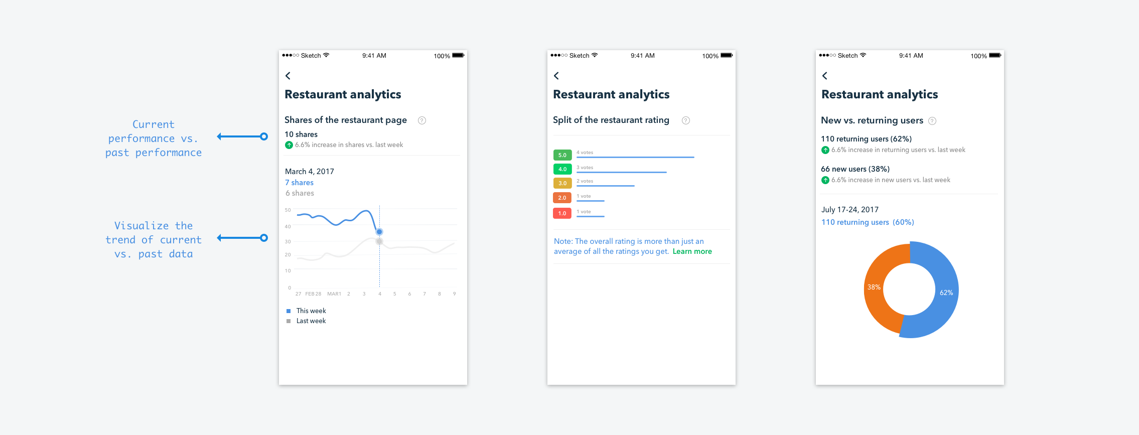
Restaurants are always looking to improve and expand their business. Owners have told us that their performance is based on the previous few months and on their performance last year at the same time (to cancel out seasonal ups and downs). It was our job to help them track their performance easily over time.
The app has to be scalable to new company products and changes to business. Currently, every editable section on the app opens on a new page, and every content creation screen has its own flow. This lets us make the editing and creation flows highly-extensible for the future.
Moreover, we are introducing web views within the app, wherever content will have to grow organically. The Help Center and new product pages will be built on these models, due to their dynamic nature.
Redesigning the Zomato for Business app was a very special project for me. I started as a product manager on this app two years ago. I was desperate to redesign it whenever I found owners having difficulty using the app. Over time, we bandaged and tended to the app and managed to keep it running. Finally when the time came to redesign the app, I was so excited to give it a new, usable interface.
I am proud of how we made this app from the ground-up and rethought every user flow that's in the app. We worked hard to make it feel easy and exciting to restaurant owners. It is light years ahead in UI and UX when compared to the old app. I am so excited to see it in the market and for restaurant owners to use it. It's about time we provide the next-level enterprise experience on Zomato!