

In 2017, Zomato wanted to increase retention of online ordering customers. My colleague Pranu and I designed Zomato Treats, a subscription service in which customers get a free dessert with every online order.
Our hope was that customers come back over time for the food and free dessert. The tendency with a subscription is to maximize its value. The subscription is priced reasonably at ₹250/year (roughly $4).
Since June 2017, we have sold over 60,000 Treats subscriptions to customers.
We asked online ordering customers how they felt about the concept of Treats. Here are a few questions we got:
We looked at how other products introduce subscription services to their customers. Amazon advertise Prime when a customer is paying for their order. Apple advertise Apple Music as a standalone feature on iTunes. These examples inspired us to promote the subscription as a standalone product, in the menu, and in the card while placing an order.
A customer can be in one of the following flows:
Flow 1 New customer buys a membership from the product page (💳 - gets only membership)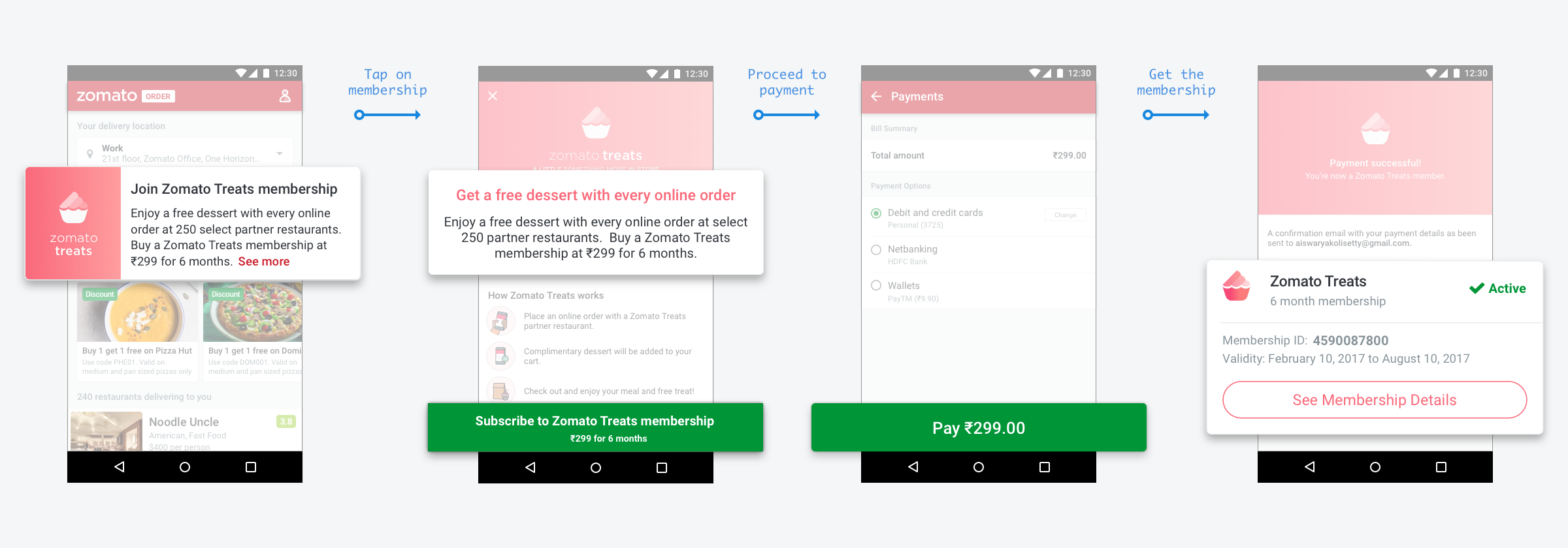
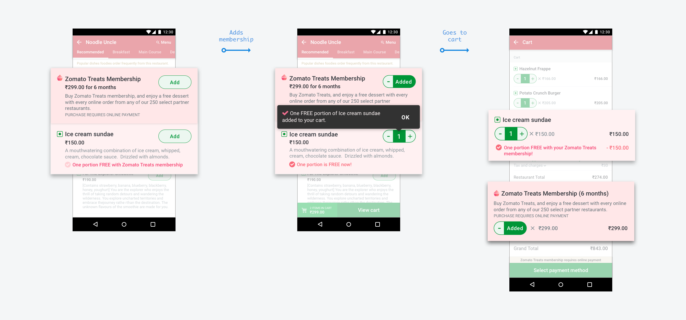
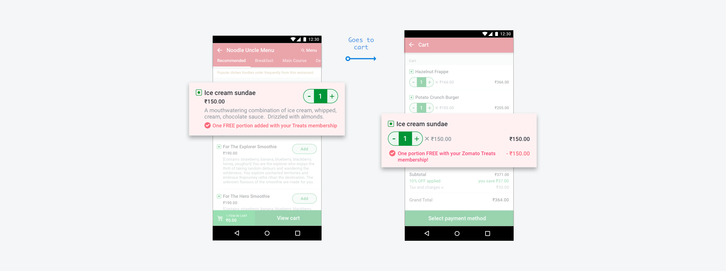
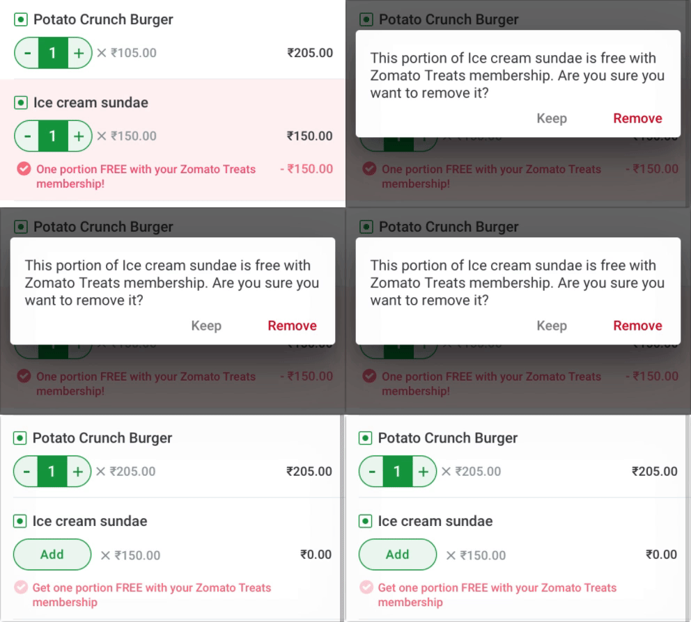
Case 1: Customer doesn't want a treat with today's order
We inform them that the dessert is free with their Treats membership. If they choose to opt out, they can tap to remove the treat.
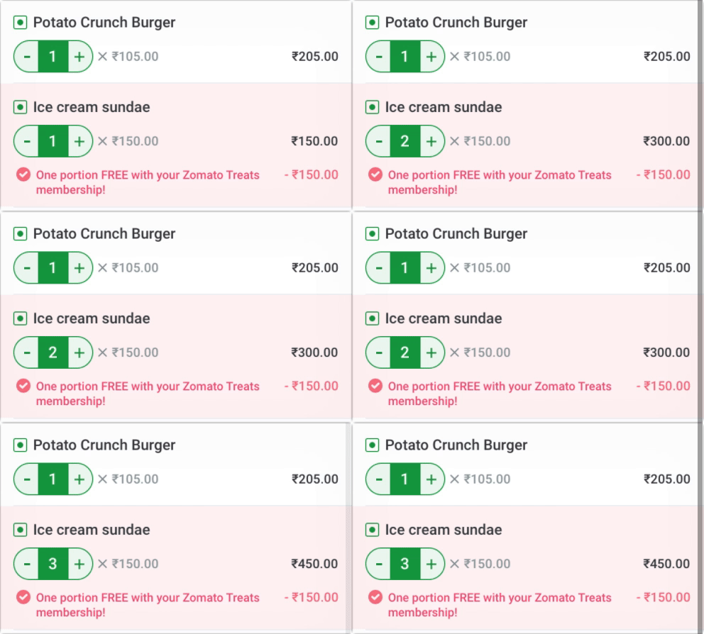
Case 2: Customer adds free treat and then 2 more
If the customer adds more quantities of the free treat, we inform them that only one portion is free with the membership. (They will have to pay for the other two ice cream sundaes!)
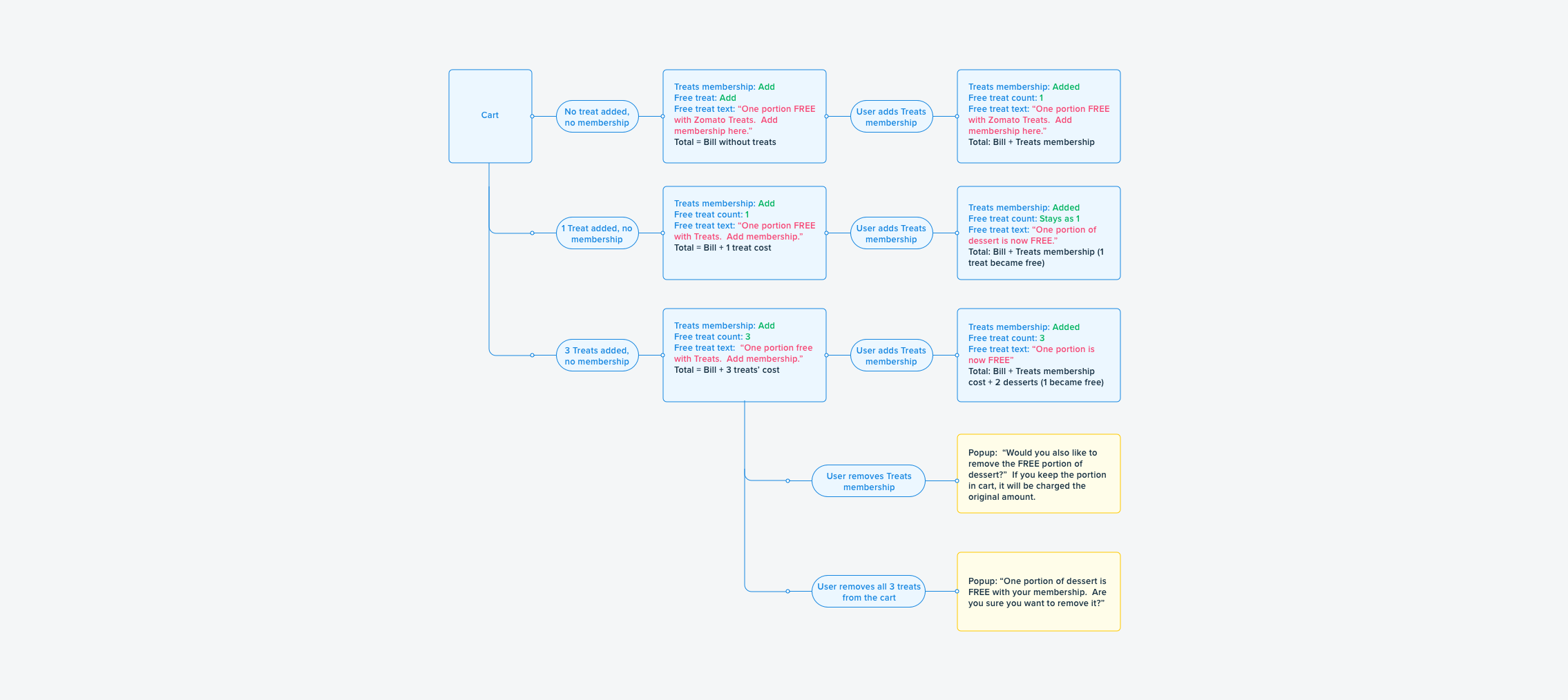
To figure out these edge cases, we had to think like developers. What could be the possibilities, what could go wrong? Developers structure alternative paths with (if/else) cases. Similarly, we arranged our artboards to match their cases. This helped them structure code based on the design conditions. We also built supporting flow charts to cover all cases.
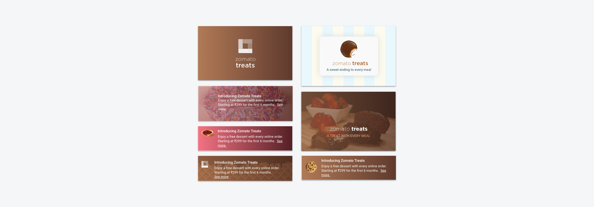
With Treats, we got to explore the visual design of the logo and product. Pranu and I had never branded a product before and we were excited. We began with mood boards and tried three themes: 1) dark/mysterious, 2) homely/festive/bright, 3) playful/fun/colorful.
Below are a few explorations based on these themes. Although our illustrator came to the rescue at the end, we had a great time experimenting with product branding. It helped us codesign the final experience with the illustrator.
P.S. Spot the illustration that's a little risque 😏
Designing for edge cases is never the first thing on my mind when I start designing a new feature. Treats — given that it appears in busy places like the menu and cart — required us to think about edge cases before we began designing. Every interaction and UI element had to adapt for all cases. If it didn’t, we had to rethink how everything fit together.
Akin to the approach of “test-driven development” found in software design, this was a great learning experience to measure our design success by validating all test cases. It helped us finish with a highly-functional design.