

When a customer orders food online, a dozen systems come to life. The restaurant starts cooking, the billing and invoicing happens in the background, the delivery boy picks up food, and the app shows an ETA. We hope the customer always receives the food on time. There are times when things don't go as planned. Maybe a new customer gets lost in the process, there’s a payment failure, or the food is late.
Our challenge in this project was to identify suboptimal experiences and provide better way around them. The project was broken up in two parts — Checkout and Crystal. Checkout is online when the customer is placing an order. Crystal — named after our desire to be “crystal clear” — is offline, and begins when the food leaves the restaurant. I worked with my colleague Pranu on this project in 2017.
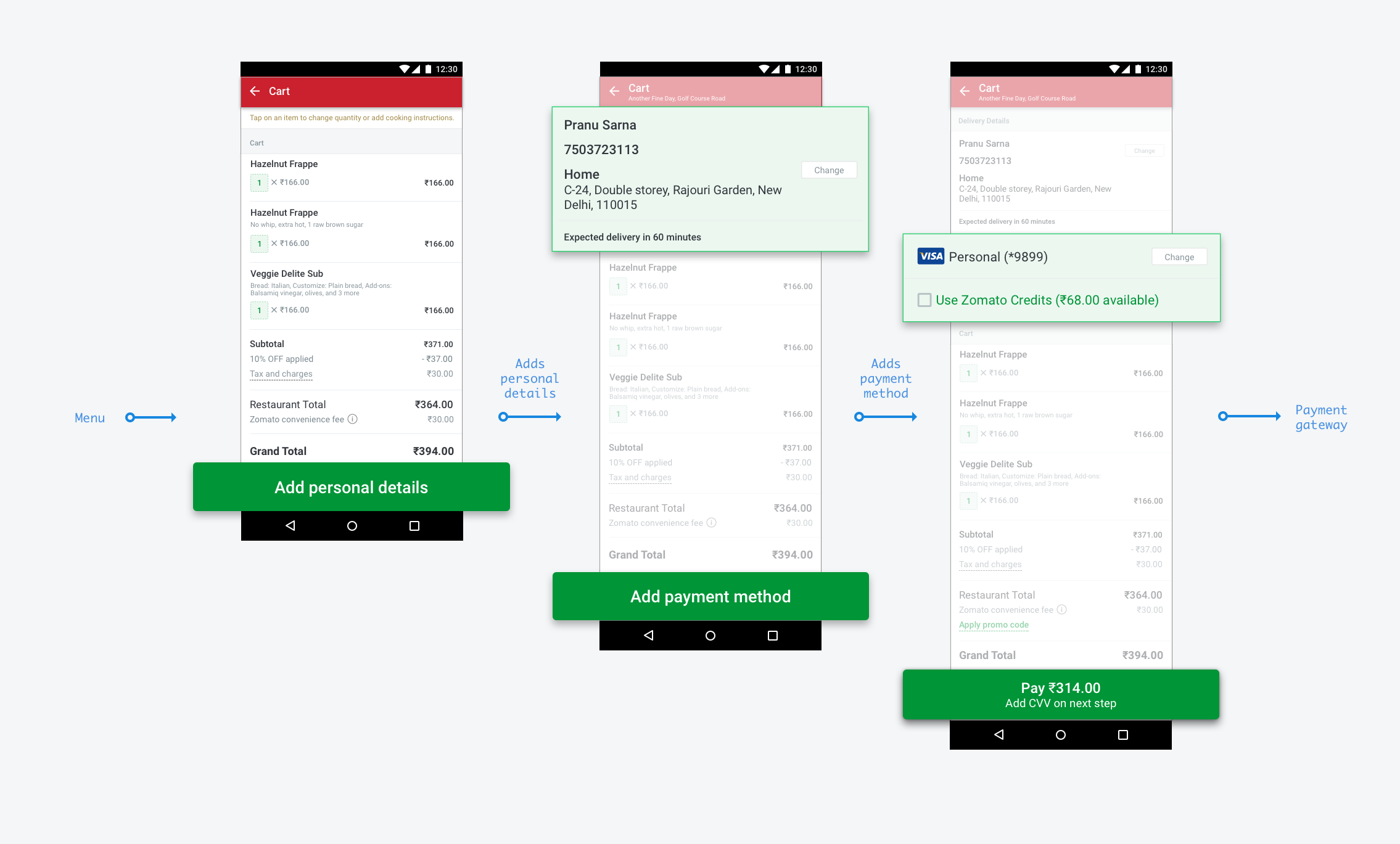
A first-time customer doesn't know how we will get food into their hands. They may have an idea if they used other food delivery platforms. Our goal was to walk them through the first-time process. We took them step-by-step: enter contact details, then enter an address and confirm it on the map, verify everything on the cart, and finally proceed to payment. This made them feel they're in control.
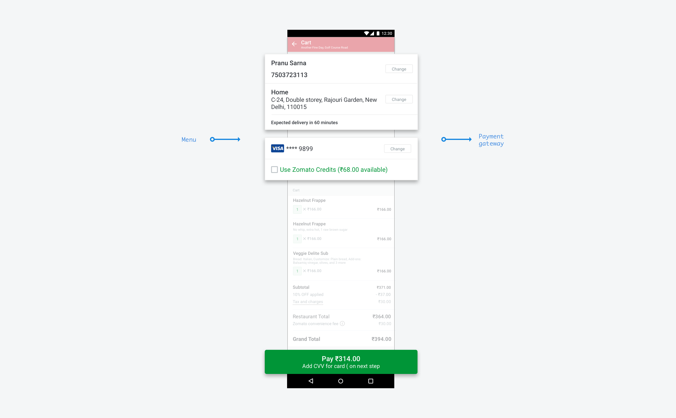
For a returning customer, we wanted to make it fast. We defaulted the customer's contact details, address, and payment method. It became a one-tap checkout to pay. Apple Pay and Amazon provided the inspiration for this flow.
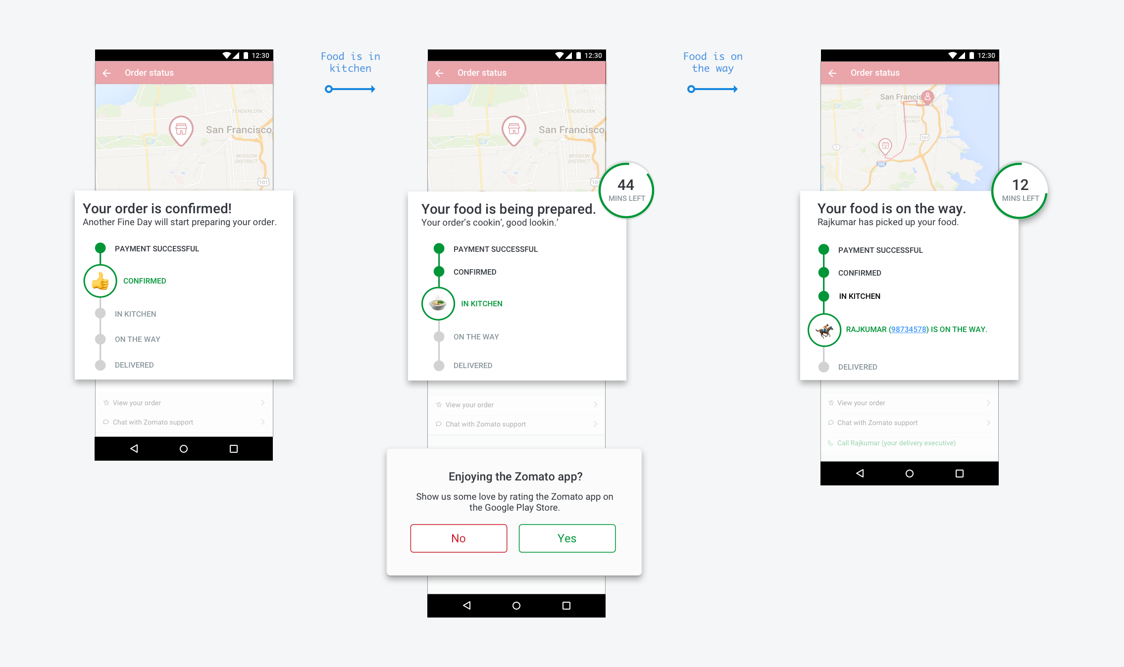
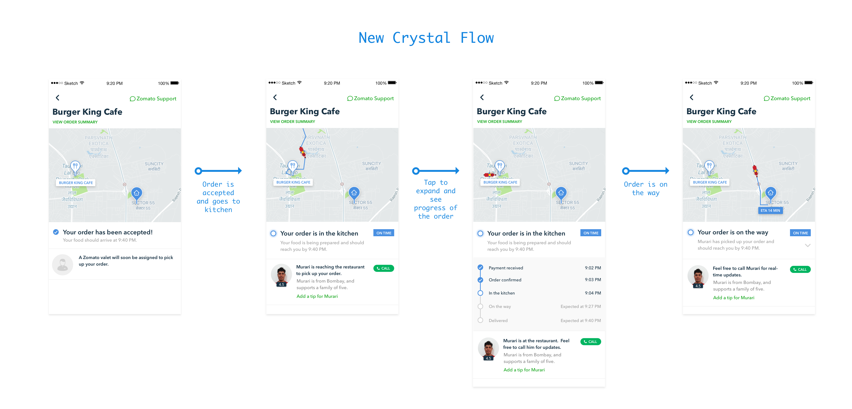
Once the order was on its way, we provided contact details for the delivery boy. This gave the customer a communication channel for the last mile delivery. (Especially useful for busy Indian roads!) Future versions included tracking the order on the map.
Late orders
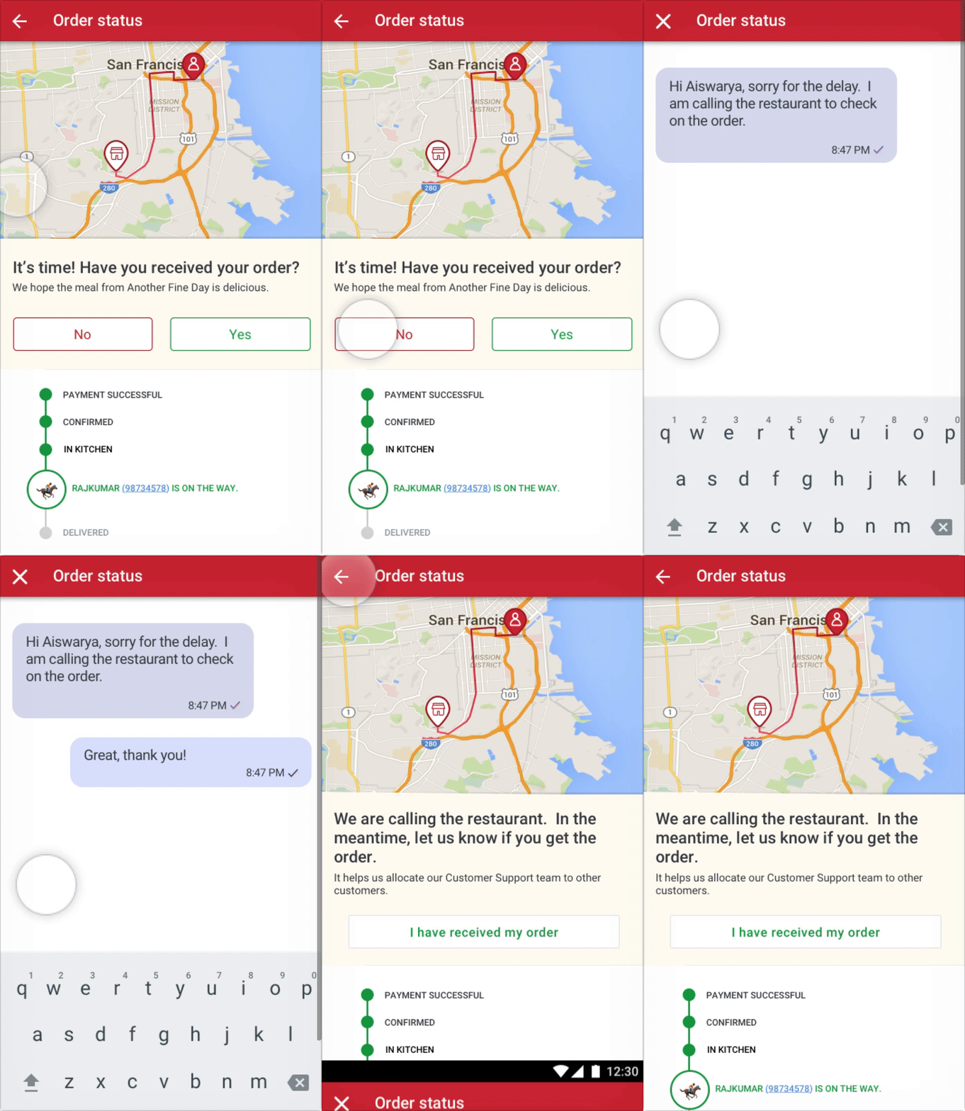
We wanted to direct customers to chat support automatically when their order is late. This ws different from earlier, when the burden to contact Zomato was on the customer. Moving the customer to support helped them make less decisions and get answers quicker. Chat let our customer support team handle 3-4 orders at once. This was a win for both sides.
Start Customer is waiting for the order
Step 1 It's time! Have you received your order?
Step 2 If "No", move customer to chat. Customer support helps out.
Step 3 User goes back to order tracking.
End User informs Zomato when they receive the order.
Our food delivery volumes grew exponentially in the spring/summer of 2018. Along with increase in volumes, there was an increase in customer support queries. We looked at existing queries and tried to solve the bulk of issues through redesign of the order status flow (i.e. Crystal).
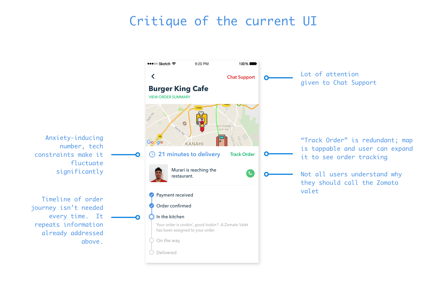
What we were out to fix:
The existing Crystal UI was also showing a lot of redundant, unnecessary information in the first fold. Below is a critique of the current UI.
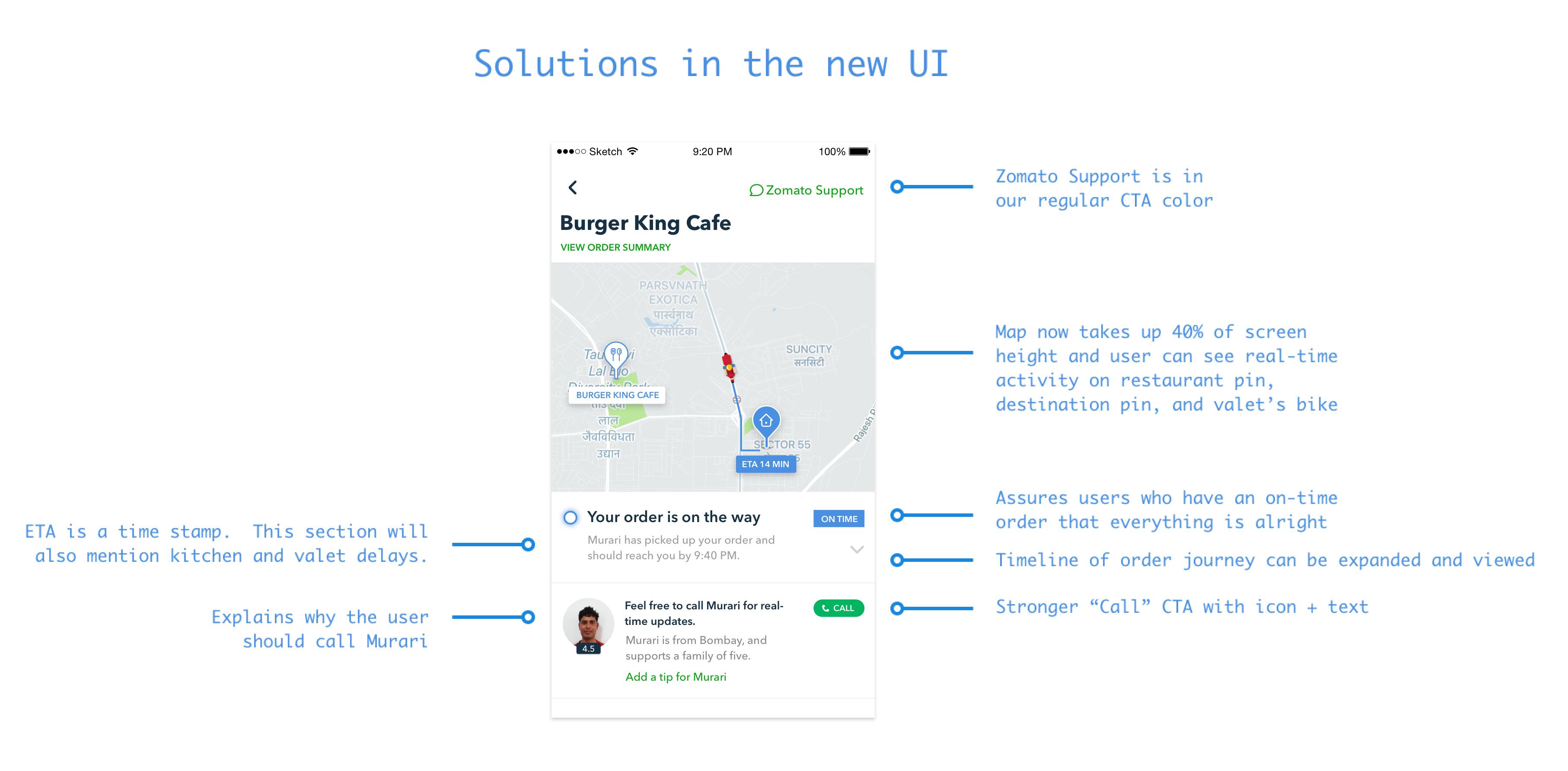
Our fixes
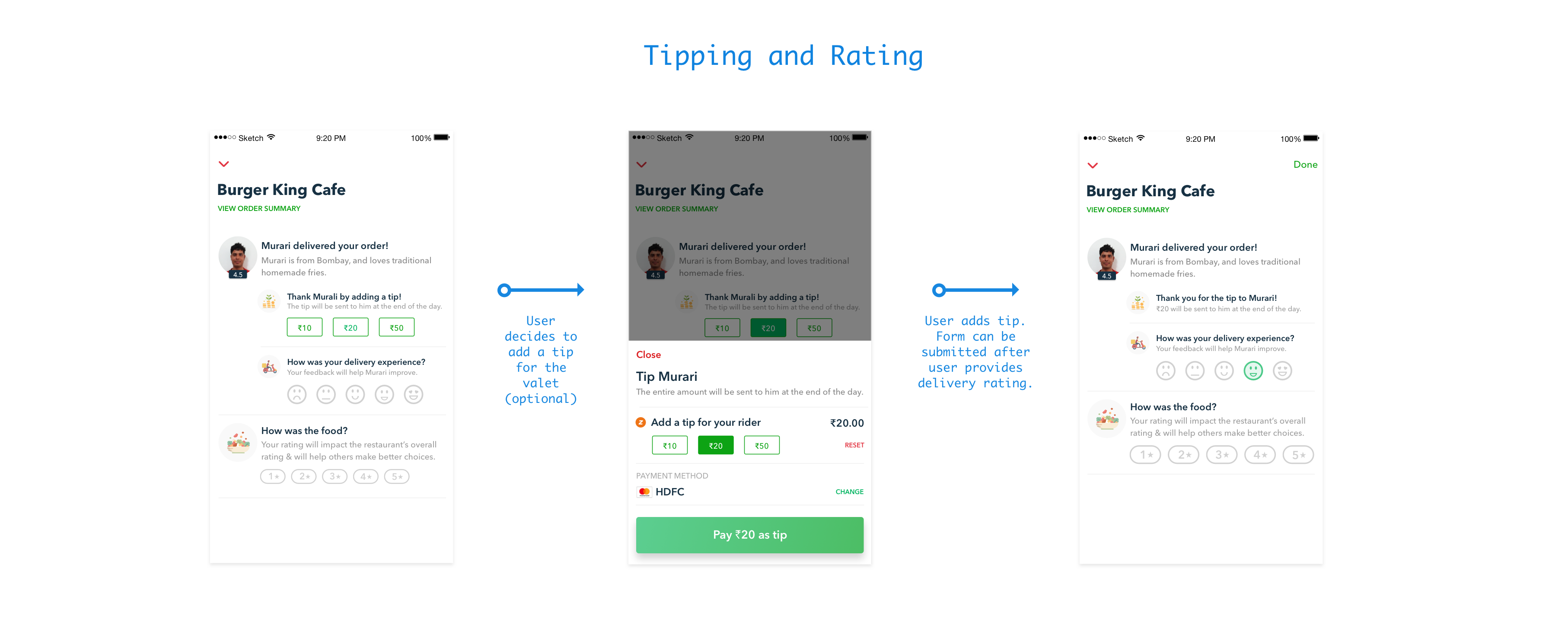
Once the user recieved the order from the Zomato valet, we wanted their feedback. We asked for a delivery rating and food rating. We also enabled tips for the Zomato valet.
A few tricky UI interactions were in balance here. One, the tip had to be paid online through the payment gateway (with OTP). This involved a breakaway from the page. Two, tip is optional and the user can feel to just provide a rating and exit. So the UI had to cater for this optional tipping flow too. Three, we wanted to minimize steps at this stage, as it is the end of the journey and optional for the user.
